DarkUI. Design in the dark. Build for the future on Tailwind CSS
DarkUI is an Open Source UI library that gives you the ultimate toolkit for dark mode on Neon Glow Glassmorphism designs. Customize it, extend it, and own 100% of the code.
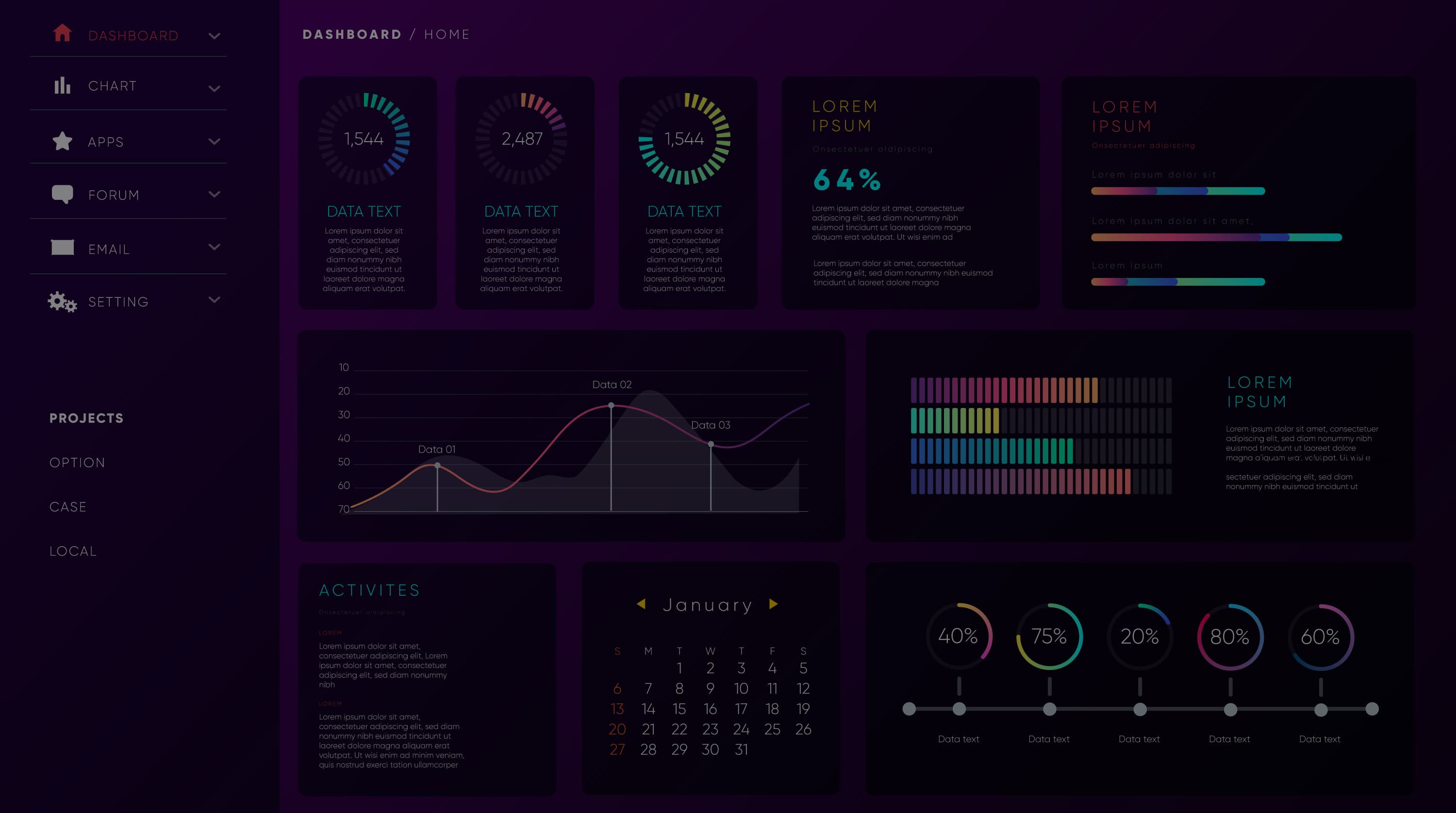
Dark-First Design
Crafted natively for dark mode, not an afterthought.
Neon Glow Effects
Cards, buttons, and highlights that pulse with life.
Glassmorphism Elements
Frosted panels and translucent surfaces for modern depth.
Build the Future in Dark Mode
Explore docs, try components, or star us on GitHub.

Buttons

Cards
Modals
Navbars
Buttons
Cards
Modals
Navbars
DarkUI Playground
Build with DarkUI Components
Create stunning interfaces with our neon-glow, glassmorphic components. Preview and copy codes for a seamless design experience.
- ✔
Buttons – Vibrant neon glow effects
- ✔
Cards – Sleek glassmorphic designs
- ✔
Inputs – Darkmode-friendly glowing inputs
<button
  className="bg-gradient-to-r from-pink-500 to-purple-700 text-white px-6 py-3 rounded-xl
    shadow-[0_0_20px_rgba(236,72,153,0.6)] hover:shadow-[0_0_30px_rgba(147,51,234,0.8)]
    transition-all duration-300 ease-in-out font-medium"
>
  Button
</button>
Get Started for Free
Bring your ideas to life in no time. DarkUI provides all the essential components you need to convert your vision into thriving start-ups.
Over
220+Examples
Tailwind CSS Plugins
Completely unstyled, fully accessible UI plugins for popular features.
Ready-to-use Blocks
Save time with prebuilt sections that fit right into your dark projects.
Themes
Choose from multiple dark themes to kick off your project instantly.
Docs
Detailed documentation to help you integrate DarkUI smoothly.
Premium Support
Get help directly from the DarkUI team with premium support plans.
Built for your favorite frameworks
Bring your ideas to life in no time. DarkUI provides all the essential components you need to convert your vision into thriving start-ups.


Build the Future in Dark Mode
Explore docs, try components, or star us on GitHub.